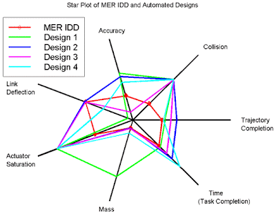
 Star plots allow you to compare different types of data for various experiments or designs. The radius of the star or design represents different characteristics. This particular star plot is a plot of MER IDD and other various designs. The different designs are compared in different categories, including mass, time (task completion), trajectory completion, collision, accuracy, link deflection, and actuator saturation. The various colors represent the various designs. This star plot was found at http://upload.wikimedia.org/wikipedia/commons/0/09/MER_Star_Plot.gif
Tuesday, April 21, 2009
Star Plots
 Star plots allow you to compare different types of data for various experiments or designs. The radius of the star or design represents different characteristics. This particular star plot is a plot of MER IDD and other various designs. The different designs are compared in different categories, including mass, time (task completion), trajectory completion, collision, accuracy, link deflection, and actuator saturation. The various colors represent the various designs. This star plot was found at http://upload.wikimedia.org/wikipedia/commons/0/09/MER_Star_Plot.gif
Correlation Matrix
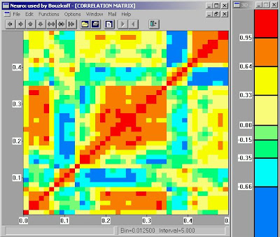
Like a similarity matrix, a correlation matrix compares two things and the relationship between them. Correlation matrices can compare how well two things correlate. For example, this particular correlation matrix shows the correlation between two things, but it doesn't list what it is comparing. A correlation means a mutual relationship between two or more things; however, no two things can ever have a 100% correlation. Therefore, the legends shows a correlation between -.66 and .95. This correlation matrix was taken from http://www.geocities.com/somesoftware/correlation_matrix.jpg.
Similarity Matrix
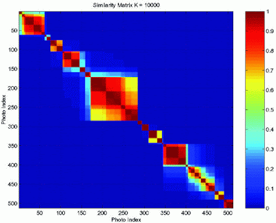
A similarity matrix shows how similar two things are. For example, similarity matrices can compare the similarity between genes. This similarity matrix compares two photo indexes. The level of similarity is depicted by the color boxes. The colors each represent a level of similarity with blue being the least similar and the deep red being the most similar. This similarity matrix was found at http://www.fxpal.com/systems/MediaAnalysis/sim10000.gif.
Stem and Leaf Plot
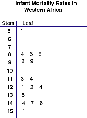 Stem and leaf plots are a way of presenting numerical data. The data found on the left hand side of the solid line is considered the stem, and the numbers on the right are the leaves. This particular stem and leaf plot depicts infant mortality rates in Western Africa. The rates range from 51 to 151. This stem and leaf plot was taken from http://mainland.cctt.org/mathsummer/JosephBond/StemAndPlots/images/table2.gif
Box Plot
 Box plots are also known as box or whisker diagrams. They are useful in comparing multiple sets of data because they display the median, the average, and the level or measurement of dispersion. This box plot shows the data from 5 experiments along with the true value. This experiments tested the speed of light. The dark black line inside the boxes shows the median value of all the data combined from that particular experimental run. The box extends from the highest value to the lowest value. The true value of the speed of light is shown in red. The numbers are presented in km/s minus 299,000. This box plot was found at http://en.wikipedia.org/wiki/File:Michelsonmorley-boxplot.svg.
Histogram
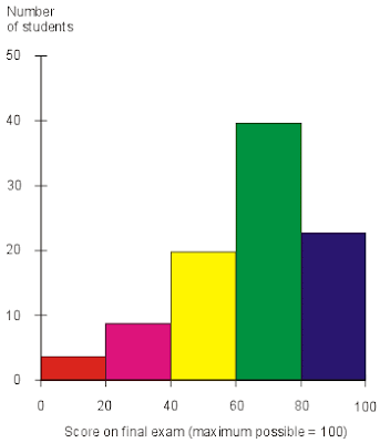 Histograms are charts that show frequencies of a particular recorded data. For example, this histogram shows the number of students or the frequencies of the scores on a final exam. It shows that most students scored in the 60 to 80 range, and the second most frequent score was in the 80 to 100 range. This histogram was found at http://media.techtarget.com/digitalguide/images/Misc/iw_histogram.gif
Parallel Coordinate Graph
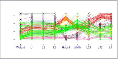
Parallel coordinate graphs display multiple data on one graph. Each variable is plotted on a vertical axis. In particular, parallel coordinate graphs can be used to compare data of different variables. This particular graph shows the relationship between weight, L1, L2, L3, Height, Width, L21, L32, and L31. This graph was found at http://www.evl.uic.edu/aej/526/kyoung/Training-parallelcoordinate.html.
Subscribe to:
Comments (Atom)