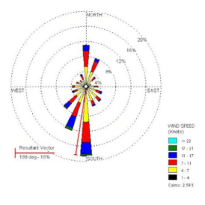
 Windrose maps represent the direction in vector form of the wind at certain speeds. Based upon the length of the vector, one can determine the frequency of the winds at that speed and direction This particular windrose is for data collected in Seattle, Washington. The most common wind direction appears to be almost due south. The colors represent wind speeds in knots, and the legend is shown at the bottom right side of the map. This windrose map was found at http://www.climate.washington.edu/windrose/Seattle-WindRose.jpg
Thursday, April 16, 2009
Windrose
 Windrose maps represent the direction in vector form of the wind at certain speeds. Based upon the length of the vector, one can determine the frequency of the winds at that speed and direction This particular windrose is for data collected in Seattle, Washington. The most common wind direction appears to be almost due south. The colors represent wind speeds in knots, and the legend is shown at the bottom right side of the map. This windrose map was found at http://www.climate.washington.edu/windrose/Seattle-WindRose.jpg
Subscribe to:
Post Comments (Atom)
No comments:
Post a Comment