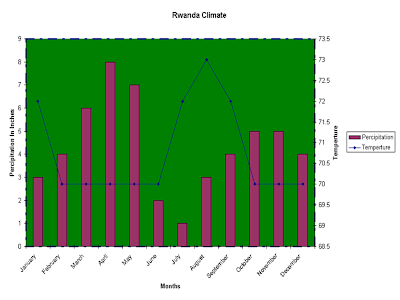
 A climograph shows how precipitation and temperature correspond during different times of the year. The precipitation is given in bar graph format and the temperature is plotted like a line graph. Both of these make up a climograph. This particular graph shows this relationship for Rwanda. The graph spans form January to December, and the rainfall is measured in inches. However, it does not say if this is a monthly average taken from multiple years or if this data is based upon 1 year. This climograph was taken from https://africawiki.wikispaces.com/file/view/climograph.png
Thursday, April 16, 2009
Climograph
 A climograph shows how precipitation and temperature correspond during different times of the year. The precipitation is given in bar graph format and the temperature is plotted like a line graph. Both of these make up a climograph. This particular graph shows this relationship for Rwanda. The graph spans form January to December, and the rainfall is measured in inches. However, it does not say if this is a monthly average taken from multiple years or if this data is based upon 1 year. This climograph was taken from https://africawiki.wikispaces.com/file/view/climograph.png
Subscribe to:
Post Comments (Atom)
No comments:
Post a Comment