 Star plots allow you to compare different types of data for various experiments or designs. The radius of the star or design represents different characteristics. This particular star plot is a plot of MER IDD and other various designs. The different designs are compared in different categories, including mass, time (task completion), trajectory completion, collision, accuracy, link deflection, and actuator saturation. The various colors represent the various designs. This star plot was found at http://upload.wikimedia.org/wikipedia/commons/0/09/MER_Star_Plot.gif
Tuesday, April 21, 2009
Star Plots
Star plots allow you to compare different types of data for various experiments or designs. The radius of the star or design represents different characteristics. This particular star plot is a plot of MER IDD and other various designs. The different designs are compared in different categories, including mass, time (task completion), trajectory completion, collision, accuracy, link deflection, and actuator saturation. The various colors represent the various designs. This star plot was found at http://upload.wikimedia.org/wikipedia/commons/0/09/MER_Star_Plot.gif
Correlation Matrix

Like a similarity matrix, a correlation matrix compares two things and the relationship between them. Correlation matrices can compare how well two things correlate. For example, this particular correlation matrix shows the correlation between two things, but it doesn't list what it is comparing. A correlation means a mutual relationship between two or more things; however, no two things can ever have a 100% correlation. Therefore, the legends shows a correlation between -.66 and .95. This correlation matrix was taken from http://www.geocities.com/somesoftware/correlation_matrix.jpg.
Similarity Matrix

A similarity matrix shows how similar two things are. For example, similarity matrices can compare the similarity between genes. This similarity matrix compares two photo indexes. The level of similarity is depicted by the color boxes. The colors each represent a level of similarity with blue being the least similar and the deep red being the most similar. This similarity matrix was found at http://www.fxpal.com/systems/MediaAnalysis/sim10000.gif.
Stem and Leaf Plot
 Stem and leaf plots are a way of presenting numerical data. The data found on the left hand side of the solid line is considered the stem, and the numbers on the right are the leaves. This particular stem and leaf plot depicts infant mortality rates in Western Africa. The rates range from 51 to 151. This stem and leaf plot was taken from http://mainland.cctt.org/mathsummer/JosephBond/StemAndPlots/images/table2.gif
Box Plot
 Box plots are also known as box or whisker diagrams. They are useful in comparing multiple sets of data because they display the median, the average, and the level or measurement of dispersion. This box plot shows the data from 5 experiments along with the true value. This experiments tested the speed of light. The dark black line inside the boxes shows the median value of all the data combined from that particular experimental run. The box extends from the highest value to the lowest value. The true value of the speed of light is shown in red. The numbers are presented in km/s minus 299,000. This box plot was found at http://en.wikipedia.org/wiki/File:Michelsonmorley-boxplot.svg.
Histogram
 Histograms are charts that show frequencies of a particular recorded data. For example, this histogram shows the number of students or the frequencies of the scores on a final exam. It shows that most students scored in the 60 to 80 range, and the second most frequent score was in the 80 to 100 range. This histogram was found at http://media.techtarget.com/digitalguide/images/Misc/iw_histogram.gif
Parallel Coordinate Graph

Parallel coordinate graphs display multiple data on one graph. Each variable is plotted on a vertical axis. In particular, parallel coordinate graphs can be used to compare data of different variables. This particular graph shows the relationship between weight, L1, L2, L3, Height, Width, L21, L32, and L31. This graph was found at http://www.evl.uic.edu/aej/526/kyoung/Training-parallelcoordinate.html.
Thursday, April 16, 2009
Triangular Plot

A triangular plot is graph that displays three types of data; since there are three variable, it's easy to present it in a triangle in order to compare them. This particular triangular plot presents the percentage of conservative, liberal, and labour votes. The dot represents the percentage of votes expected based upon polls. This is UK data, and it was published on April 7, 2005. This plot was taken from http://www.ex-parrot.com/~chris/wwwitter/20050407-it_doesnt_matter_how_you_vote_either_way_your_planet_is_doomed.html.
Windrose
 Windrose maps represent the direction in vector form of the wind at certain speeds. Based upon the length of the vector, one can determine the frequency of the winds at that speed and direction This particular windrose is for data collected in Seattle, Washington. The most common wind direction appears to be almost due south. The colors represent wind speeds in knots, and the legend is shown at the bottom right side of the map. This windrose map was found at http://www.climate.washington.edu/windrose/Seattle-WindRose.jpg
Climograph
 A climograph shows how precipitation and temperature correspond during different times of the year. The precipitation is given in bar graph format and the temperature is plotted like a line graph. Both of these make up a climograph. This particular graph shows this relationship for Rwanda. The graph spans form January to December, and the rainfall is measured in inches. However, it does not say if this is a monthly average taken from multiple years or if this data is based upon 1 year. This climograph was taken from https://africawiki.wikispaces.com/file/view/climograph.png
Population Profile
 A population profile can be presented in the form of a population pyramid. They display age and sex population data for specific regions. This particular population pyramid shows the percent of the population (male and female) in each age division for the population growth for Mobile County. The data was taken from the 1998 Census. The light blue represents the percent that is female, and the dark blue represents the percent that is male. This pyramid was taken from http://camellia.shc.edu/literacy/tablesversion/assignments/Image2.jpg.
Wednesday, April 15, 2009
Scatterplot
 A scatterplot is an plot that shows the relationship or trend between two types of data. The values, or observations, are presented as dots, and after enough have been plotted, a trend line is added in order to determine the best relationship between the two. This particular scatterplot depicts the trend in a husband's age to a wife's age in order to determine if there is a relationship between the two. For the most part, the trend shows that an increase in a husband's age will also cause an increase in a wife's age. However, there are definitely outliers and data that varies from that trend. This plot was taken from http://cnx.org/content/m10950/latest/age_scatterplot.gif
Index Value Plot
 In an index value plot, an index value is plotted instead of an actually number. This type of plot gives a comparison, or normal, in order to base the values off of. In this particular visualization, the average stream flow index is plotted based upon particular days of the week. The number value of comparison is 4. This data was collected in North Carolina and ranged from mid February to the end of March. This plot was taken from http://water.usgs.gov/waterwatch/?m=real&r=nc&w=real%2Cplot.
 Lorenz Curve
 A Lorenz curve is used to display probability distribution. The straight line shows the values if X and Y were proportional, and the curve shows actually distribution that is not equal. This particular Lorenz curve shows the relationship between the percentage of households verses the percentage of income. For example, it states that 60% of income is concentrated in 80% of households, meaning that the income is not distributed equally. This map was taken from http://en.wikipedia.org/wiki/Lorenz_curve.
 Bilateral Graph

Bilateral graphs are a type of visualization graphs which depict two relatable variables; the best use of bilateral graphs is to show the relationship between the two variables whose trends are moving in opposite directions. For example, this particular bilateral graph depicts the relationship between the falling unemployment rate and the rising job rate after Bush signed Job and Growth Act. This map spans from Jan.2003 to Nov.2005. This map also presents the average unemployment rate from 1960-2005 in order to show the extreme plunge in the unemployment rate. This map was taken from http://www.ustreas.gov/press/releases/images/november%20jobs%20graph.jpg.
Monday, April 13, 2009
Nominal Area Choropleth Maps

Nominal area choropleth maps are choropleth maps that depict nominal data; this data is quantitative and random . The different colors represent variations in data. This map is broken into 2 divisions. The map depicts the political party selections per each state based upon the poor voters. The blue states represent the democratic party while the red states represent the republican party. This map was taken from http://www.stat.columbia.edu/~cook/movabletype/archives/2007/10/some_cool_graph.html.
Unstandarized Choropleth Maps
 Unstandarized choropleth maps are maps where the data has not been averaged. The data is presented in numerical values. This particular map shows the number of hazardous waste site installations per state in 1997. Since these numbers are raw numbers; it is an unstandarized map. The choropleth map is broken into 6 equal step intervals. The legend is present at the bottom of the map. The different colors represent different values of waste site installations. This map was found at http://www.okstate.edu/sas/v7/sashtml/books/graph/images/01215109.gif.
Standardized Choropleth Maps

Standardized choropleth maps are maps where the data is areally averaged. Areally averaged data can be presented in many different ways such as densities or percentages. This particular map is an example of a standardized choropleth maps and a classed choropleth map. It shows the percent of the Canadian population under the age of 14. This data was collected from the 2006 Census. This map was taken from http://www.statcan.gc.ca/pub/92f0138m/2008003/figures/5200001-eng.htm.
Univariate Choropleth Maps

Univariate choropleth maps are basic choropleth maps that present only one set of data, unlike bivariate choropleth maps that present two sets of unrelated data. This particular choropleth map presents the presidential vote to the electoral votes in percent of mean. The map is divided into 5 intervals of percentages. This data shows that votes per ballot are not equally distributed. This map is taken from http://www.cartisan.com/map_resources/map_types/images/choropleth.jpg.
Bivariate Choropleth Maps

Bivariate cholorpleth maps present 2 very different types of data on one cholorpleth map using the same boundaries, using various shading or patterns. This particular map portrays both the the GNP per capita and the life expectancy in Africa. The pie chart at the bottom displays the land use, but it is not depicted on the cholorpleth map. The legend of the choropleth maps is displayed on the bottom left corner; it shows how to read the various colors found on the map, as they are a mix between the two data intervals. The GNP is shown and blue, and it is mixed with the orange (life expectancy) to get the color found on the map. The GNP is given in US dollars. This map was taken from http://www.geocities.com/stevejford/Africa_Choropleth.jpg
Unclassed Choropleth Maps

Unclassed choropleth maps are choropleth maps on a much larger scale; the scales are not small enough to depict an accurate numbers, but rather present it where much of the country or area falls in the same interval. This particular maps is both an unclassed choropleth map and a flow chart. The choropleth data presents the state to state flow of tons of truck flow, and the flow chart shows the flow of trucks out of Texas. The choropleth map has only 4 intervals, and most of the country falls under one color intervals. This map was taken from http://www.lib.utexas.edu/maps/texas/combtrk_tx_1998.jpg.
Classed Choropleth Maps
 Choropleth Maps present various types of statistical data or areal data. A classed choropleth map is a particular type of choropleth map that uses smaller intervals to portray the data. It is broken down into a scale and presented using colored intervals. This particular map has 5 classification internals. The colors used to display that data are from light yellow to dark green. This map is an standardized map as well since it presents the data per student. This map depicts the amount in dollars spent per student in the Public Education System in North Carolina. The statistics are for the 1994-1995 school year. This map was taken from http://personal.uncc.edu/lagaro/cwg/color/Choropleth-5Good.gif.
DOQQ Map

A DOQQ map stands for digital orthoquarter quads. These maps are delevolep from raster images from aerial photos. Depending upon the film used, they are presented in real or true color or false infared color. This particular picture above is a red colored DOQQ of a 500 year flood plain. The water is easily recongizable by the blue color. This image was taken from http://www.crwr.utexas.edu/gis/gishydro00/Class/trmproj/Donnelly/termproject.htm.
Thursday, April 9, 2009
DEM Maps
 DEM maps are known as Digital Elevation Maps. They display data on the elevation of land masses. DEM maps are forms of topographical maps. This particular map shows the elevation of Greece. The elevation is depicted by various color changes present on the map; however, there is no legend that shows what the colors correspond to. This map was taken from http://commons.wikimedia.org/wiki/File:Chalkidiki_-_DEM_Map_Topo_-_DE.png.
DLG Maps

DLG maps are known as Digital Line Graphics; they show boundaries, roads, and other various information found on topographical maps. DLGs are a form of graphic information systems; a great deal of information this system is required in order to process DLG information. This particular map shows cartographic detail of Illinois. It displays gravel pits, sewage disposal, and roads. It was taken from http://pubs.usgs.gov/of/2003/of03-471/domier/index.html
DRG Maps

DRG maps are scanned topographic maps and are known as Digital Raster Graphics. These images include all the detail found on the topographical map. This map shows the Colorado River, which flows through Austin. This river should not be confused with the Colorado River that forms the Grand Canyon. The map also includes various locations along the River that help to distinguish the section of the River shown. These include Walter Beach, Riverside, Buford Tower, and Auditorium Shores to name a few. This map was taken from http://www.tceq.state.tx.us/gis/drg.html.
Isopleth Maps
 Isopleth maps are contour maps respresenting various data. They can display variables such as temperature, pressure, wind, rain, etc. There are many types of isopleth maps, including
 Bathymetric maps, isohyet maps, and isotach maps. This particular map shows pH concentrations throughout the United States. These pHs were gathered in field laboratories. The legends shows that various colors are used to present the varying pH values. The data was collected in 1998. The map was taken from http://nadp.sws.uiuc.edu/isopleths/maps1998/phfield.gif
Wednesday, April 8, 2009
Isopach

Isopach maps show thickness of rock beds or sediment deposits. They may be convent for engineers attempting to reach the local water tables or for scientists looking for the best place to drill for oil. This particular map above shows the thickness of sediment deposits from flood. The map uses colors to distinguish more easily between the different levels. The thickness of the deposits is measured in centimeters. This flooding happened along the Brazos River in Texas. These measurements were taken in January of 1993. This map was taken from http://gulf.rice.edu/modBdel.html.
Isohyets
 Isohyet maps shows areas of equal rainfall via contour lines. These lines connect geographical locations who measured the same amount of precipitation. These maps may be useful in collecting and analyzing rainfall data over extended periods of time. The map above is a rainfall map of New Zealand. It depicts the rainfall for the month of July 2008. The contour lines are equivalent to 100mm of rainfall. This map was found at http://www.scoop.co.nz/stories/AK0808/S00090.htm.
 Isotachs
 Isotach contour lines are lines that show areas of equal wind speed. Like isobar graphs, these maps are used in depicting weather. The map shown above displays contour lines for wind speed in Canada. The numerical displays of the wind speeds are calculated hourly averages calculated at 10 meters above the ground. The map was taken from http://www.stresscrete.com/technical-resources/wind-maps/canadian-isotach-wind-map.asp.
Isobars
 Isobar lines are a type of contour lines. These lines show areas of equal air or atmospheric pressure. This is a common type of graph used to depict weather conditions. This particular graph shows a forecast for Friday April 3, 2009. The different colored lines show areas of different pressures. The forecast is for a small portion of the Eastern Hemisphere, mostly Europe.
This map was taken from http://www.windfinder.com/weather/. However, the link will always displace the most current forecast.
Tuesday, April 7, 2009
LIDAR

LIDAR is a form of remote sensing. It stands for Light Detection and Ranging. This type of remote sensing employs the use of laser light to help gather images. This is an incredibly accurate technique in measuring elevation of the land. For example, the map pictured above is a Digital Elevation Model (or DEM map) constructed by the use of LIDAR. It shows the elevation of Wrightsville Beach through use of various color scales. However, the key shown on the lower right side does not give a unit for measurement, but I would assume that the elevation is measured in feet. This map was constructed in 1997.
It was taken from http://www.csc.noaa.gov/products/nchaz/htm/intro.htm
Doppler Radar

Doppler Radar is primarily used to track weather across our country. It searches for the motion of clouds, changes in pressure, and particles in the air. Doppler Radar images may seem like that should be very easy to read; however, there is a lot more science to it than what is portrayed on weather reports. This particular Doppler Radar indicates severe rain in the southeastern United States and up towards the Great Lakes. This radar image was from April 3, 2009 at 1:38 GMT.
This image from taken from http://www.weather.com/maps/news/forecastsummary/usdopplerradar_large.html. However, the image has changed since the weather has changed. Therefore, this radar image can no longer be viewed. It has been replaced by the most current images that radars are gathering.
Black and White Aerial Photo
 Black and White aerial photography shows overhead/aerial views of various parts of land and water. These masses emit in wavelengths sensitive to the human eye. This particular aerial photograph is of downtown Johnstown during the 1980s. In this photo, it is possible to view the buildings and their placement and relative heights. Also, it shows where roadways are placed and where trees start and end. It was taken from http://www.jaha.org/edu/flood/rebuild/img/panoramas/1100w/JT_aerial-1950s.jpg
Infrared Aerial Photo

Infrared Aerial Photography can be used in many different ways. Objects give off infrared radiation, and it is captured on the film. Even though IR cannot be seen, the film turns it into false color that humans can see. Infrared photography can be used to track changes in our environment. For example, this particular photograph is of the Sacramento Deep Water Channel in California. In contrast, black and white aerial photography is also used. However, infrared photography can give much more detail. For example, water reflects differently and is much more pronounced in IR photography. Also, different planets/trees appear differently in IR, so a skilled photographer should be able to distinguish the types of vegetation found in an area.
This photo was taken from http://www.aerialarchives.com/Infrared-Aerial-Photography.htm
Monday, April 6, 2009
Cartographic Animation

Cartographic animation is used to depict movement across lands or entities that would otherwise be very difficult to portray. These maps are typically seen on a computer or on a TV, where information can be continuously transmitted. A common cartographic animation is that of a radar or weather map. The animation shows movement of storms and cells across the country. If this map wasn't a frozen shot, it would show movement of the green mass of rain across the area. This map was taken from http://images.apple.com/downloads/dashboard/information/images/radarinmotion_20070608173303.jpg.
Statistical Maps

Statistical maps are based upon numerical values. The given map depicts statistical changes in burglaries in the Denver, Colorado, area. The yellow areas indicate a decrease in crime from 2001 to 2002; the orange areas show an increase; and the white areas stayed the same. Also, if you zoom in, texts superimposed on the divisions show the percentage increase and the percentage decrease. Overall, there was an increase in burglaries in the city of Denver from 2001 to 2002, and that is depicted through a statistical map.
It was taken from http://www.denvergov.org/Portals/335/images/SOPA_bur02.jpg
Cartograms

A cartogram is a map in which the area and size has been rescaled in proportion to the variable being studied. For example, this is a map of the United States that has been resized in order to reflect the population of the various states. (ie. Florida is much bigger than it is on a real map, and other states such as North Dakota are much smaller) The colors on the map indicate the way the population voted in the 2004 Presidential Election in popular vote, not electoral college. The more blue the area is, the more democratic and the more red the area is, the more republican. The purple areas indicate a pretty even distribution, a 50/50 vote.
This map was taken from http://en.wikipedia.org/wiki/File:Cartlinearlarge.png.
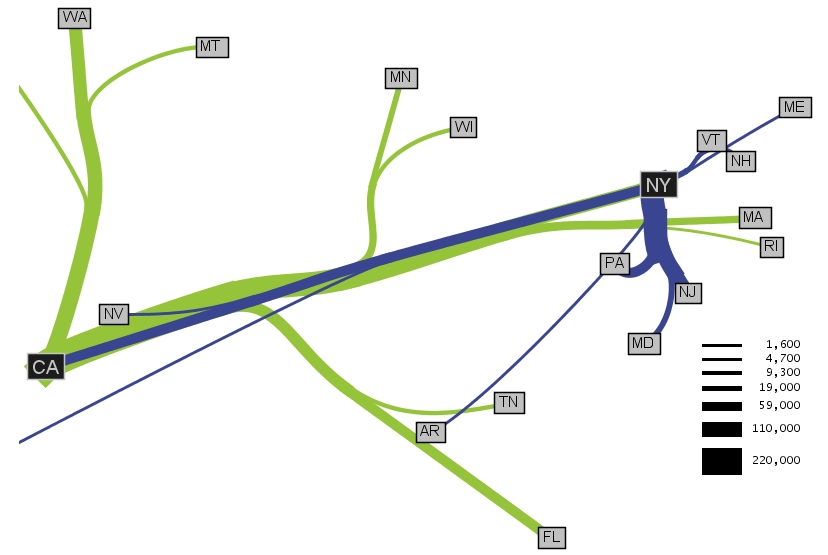
Flow Maps

Flow maps are used to show actual paths and intensities across a surface/land mass. Specifically, they can be used to show locations of travel, like this particular map. If they show paths of travel, they will only represent general direction, not actual paths. This particular map shows the top 10 states that migrate to New York and California. It does not show the paths, but rather general directions. The intensity of the migration, or the number of people moving, is given by the thickness of the lines. The scale is shown on the bottom right of the map. The green lines show migration to California, and the purple lines show migration to New York City.
This map was taken from http://graphics.stanford.edu/papers/flow_map_layout/ca-ny-web.jpg.
Sunday, April 5, 2009
Isoline Maps
 Isoline maps are any type of contour map, or a map with lines representing equal values. Isoline maps can be used with many different types of data including pressure, population, winds, etc. These isolines are another way of presenting a third dimension. In this particular map, the isolines represent common wind speeds. This map says that there will be strong winds throughout most of the central United States. The different shades of blue depict the various wind speeds. Meteorologists use these types of maps all the time to depict the weather patterns to viewers. This map was taken from http://www.kidsgeo.com/geography-for-kids/0034-isolines.php
Proportional Circle Maps
 Proportional Circle maps are very similar to dot distribution/dot density maps in that they use shapes to depict numerical values on the maps. However, with a proportional circle map, the size of the circle is directly related to the data it presents, but not necessarily the area that it is covering. This particular example depicts zinc deposits found in a small portion of Canada. The larger dots presents a greater amount of zinc found in the soil. The amount of zinc is measured in ppm or parts per million. It also gives a legend for different types of deposits. The distances scale is also shown at the bottom of the map, so the map reader can determine how much area the map covers and what the actual distances is from circle to circle.
This map was taken from http://gsc.nrcan.gc.ca/mindep/synth_dep/sedex/index_e.php,
and it can be found in a larger scale at http://gsc.nrcan.gc.ca/mindep/synth_dep/sedex/images/fig17.jpg
Choropleth Maps

This is an example of a cholopleth map. In particular, this map is a classed univariate cholopleth map. That means that the scale is divided up in equal 5 step intervals and depicts only one variable. This map shows the average spending by overseas residents in Great Britain in 2003. The scale is in millions of pounds. The map is shaded in pink. This is a good example of a cholopeth map. It was taken from http://www.neighbourhood.statistics.gov.uk/HTMLDocs/images/BP%2520Maps6_tcm97-50746.jpe
Dot Distribution Maps
 This map is a dot distribution map of the United States. It is based upon the 2000 Population of the US. Each dot represents 7500 people. With this particular style of map, the dots never change size, but remain constant in order to depict population correctly. The areas at are more white represent areas of our country with higher populations. This map shows that most of the country's population is concentrated on the east coast, especially in the New England states.
 This map was taken from http://www.census.gov/geo/www/mapGallery/2kpopden.html.
Friday, April 3, 2009
Hypsometric Maps
 Hypsometric maps are surface maps that depict relief or elevation. This can be shown via color, contour lines, or raised relief. This particular map uses color to show elevation in a Cuban Archipelago. The scale is 1: 1,000,000. It shows elevation from 1 to 1970 and bathymetry from 0 to >>-6000. The shading gives a three dimensional view, which helps to portray the elevation depicted on the map. This map was taken from http://igitur-archive.library.uu.nl/dissertations/2008-1010-200655/Annex4A.jpg
PLSS Maps

PLSS Maps are created from the Public Land Survey System, which divides the land of the United States into ownership. It is a prime example of systematic land cadastral system. This map shows the partitioning of Ohio into various sections based upon a system that was not fully developed. It is not based upon the Principal Meridians. The sections that are shown the Virginia Military Survey, the Ohio Co. Purchase, and the Connecticut Western Reserve, to name a few.
This map was taken from http://rnp782.er.usgs.gov/atlas2/articles/boundaries/a_plss.html
Cadastral Maps

Cadastral Maps are maps that shows ownership and boundaries. This particular map is a map of Delware County in Delware, Ohio. The sections are color coordinated in order to show the boundaries. The sections are also clearly labeled with names in order to give more distinction of the ownership. This is a form of a land partitioning system.
This map was taken from http://www.dalisproject.org/(S(mcnlbx55sbjep255ckkset55))/pages/findMapsheet.aspx
Thematic Maps
 Thematic maps are used to represent particular aspects of a region. There are many different types or methods of thematic mapping, including chloropeth, isarithmic, dot, and proportional symbols just to name a few. This particular map is a chloropeth map that shows the median age of the population in various states. The color scheme ranges from pale yellow to dark green in order to indicate the ages. This map shows only the northeastern part of the United States.
 This map was taken from http://www.lib.wsc.ma.edu/themap.jpg
Thursday, March 19, 2009
Topographic Maps
at 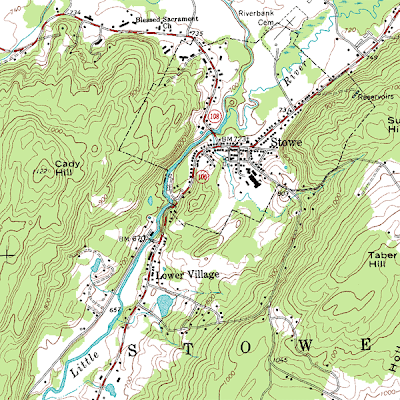

Topographic maps are a certain type of contour maps. They show relief and are typically respesented in large scale detail. This particular map shows elevation for Stowe, Vermont in 20 foot contour intervals. The map also displays various city locations, such as the Lower Village, and bodies of water, such as the Little River. The scale for this map is 1:24,000. The image was taken from http://en.wikipedia.org/wiki/File:Topographic_map_example.png
Planimetric Maps

Planimetric maps are maps that show no relief features. They convey strictly 2D information; therefore, a feature, such as elevation, will never be found on a planimetric map. A common type of planimetric map is a street map. The picture above is an example of a planimetric map of Austin, TX. This map displays roads, landmarks, and bodies of water, but the main purpose of the map is to display major powerlines running throughout the city. It also includes the locations of dams found on the rivers. The map scale or ratio is 1:100,000.
The map was taken from http://www.lib.utexas.edu/maps/texas/austin_1985.jpg .
Monday, January 12, 2009
Mental Map

A mental map shows a visual image inside a person's head; these images are very abstract but represent an actual location; it may be of places a person has traveled and the details that the person knows about the various locations. In this particular map, it seems that it is portraying places that a person visited along with various events that took place at each location around Coal City, Illinios in the 1940s.
This map was taken from http://www.uky.edu/~ulack/Geo152/unnumbered%20figure%20pg%2003.jpg.
Subscribe to:
Posts (Atom)