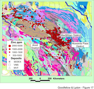
 Proportional Circle maps are very similar to dot distribution/dot density maps in that they use shapes to depict numerical values on the maps. However, with a proportional circle map, the size of the circle is directly related to the data it presents, but not necessarily the area that it is covering. This particular example depicts zinc deposits found in a small portion of Canada. The larger dots presents a greater amount of zinc found in the soil. The amount of zinc is measured in ppm or parts per million. It also gives a legend for different types of deposits. The distances scale is also shown at the bottom of the map, so the map reader can determine how much area the map covers and what the actual distances is from circle to circle.
This map was taken from http://gsc.nrcan.gc.ca/mindep/synth_dep/sedex/index_e.php,
and it can be found in a larger scale at http://gsc.nrcan.gc.ca/mindep/synth_dep/sedex/images/fig17.jpg
No comments:
Post a Comment