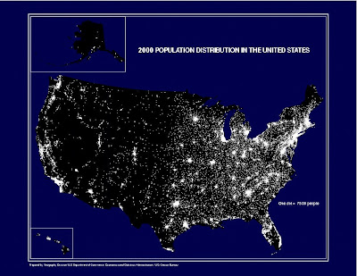
 This map is a dot distribution map of the United States. It is based upon the 2000 Population of the US. Each dot represents 7500 people. With this particular style of map, the dots never change size, but remain constant in order to depict population correctly. The areas at are more white represent areas of our country with higher populations. This map shows that most of the country's population is concentrated on the east coast, especially in the New England states.
 This map was taken from http://www.census.gov/geo/www/mapGallery/2kpopden.html.
No comments:
Post a Comment