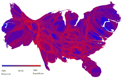
A cartogram is a map in which the area and size has been rescaled in proportion to the variable being studied. For example, this is a map of the United States that has been resized in order to reflect the population of the various states. (ie. Florida is much bigger than it is on a real map, and other states such as North Dakota are much smaller) The colors on the map indicate the way the population voted in the 2004 Presidential Election in popular vote, not electoral college. The more blue the area is, the more democratic and the more red the area is, the more republican. The purple areas indicate a pretty even distribution, a 50/50 vote.
This map was taken from http://en.wikipedia.org/wiki/File:Cartlinearlarge.png.
No comments:
Post a Comment