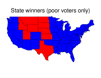
Nominal area choropleth maps are choropleth maps that depict nominal data; this data is quantitative and random . The different colors represent variations in data. This map is broken into 2 divisions. The map depicts the political party selections per each state based upon the poor voters. The blue states represent the democratic party while the red states represent the republican party. This map was taken from http://www.stat.columbia.edu/~cook/movabletype/archives/2007/10/some_cool_graph.html.
No comments:
Post a Comment