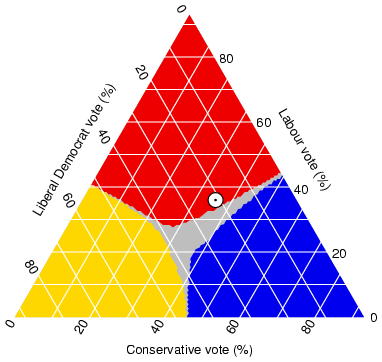
A triangular plot is graph that displays three types of data; since there are three variable, it's easy to present it in a triangle in order to compare them. This particular triangular plot presents the percentage of conservative, liberal, and labour votes. The dot represents the percentage of votes expected based upon polls. This is UK data, and it was published on April 7, 2005. This plot was taken from http://www.ex-parrot.com/~chris/wwwitter/20050407-it_doesnt_matter_how_you_vote_either_way_your_planet_is_doomed.html.
No comments:
Post a Comment