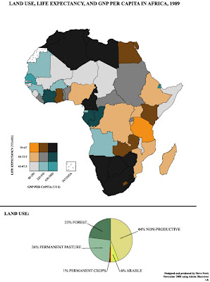
Bivariate cholorpleth maps present 2 very different types of data on one cholorpleth map using the same boundaries, using various shading or patterns. This particular map portrays both the the GNP per capita and the life expectancy in Africa. The pie chart at the bottom displays the land use, but it is not depicted on the cholorpleth map. The legend of the choropleth maps is displayed on the bottom left corner; it shows how to read the various colors found on the map, as they are a mix between the two data intervals. The GNP is shown and blue, and it is mixed with the orange (life expectancy) to get the color found on the map. The GNP is given in US dollars. This map was taken from http://www.geocities.com/stevejford/Africa_Choropleth.jpg
No comments:
Post a Comment